ALX Certified Analyst
👋Hello, I’m Hope, a Data Analyst. With over 5 years of expertise in strategy, business development, and analytics. I transform data into actionable insights that boost revenue and reduce costs.
👋Hello, I’m Hope, a Data Analyst. With over 5 years of expertise in strategy, business development, and analytics. I transform data into actionable insights that boost revenue and reduce costs.
👋Hello, I’m Hope, a Data Analyst. With over 5 years of expertise in strategy, business development, and analytics. I transform data into actionable insights that boost revenue and reduce costs.


Projects
Projects
A glimpse into some of the projects I have worked on
Amazon Sales Dashboard
The Amazon Sales Dashboard provides a detailed overview of the company's sales performance, focusing on key metrics such as total quantity sold, profit, revenue, and cost. It analyzes sales through different channels, item categories, order priorities, and regions. The dashboard also tracks the yearly profit trend from 2010 to 2017, offering insights into how profits have shifted over time and across different product lines and geographical areas.
Power BI
Data Visualization
Dashboard
View Project
Corona Virus COVID-19 Confirmed Cases by Location Dashboard
This dashboard provides a global perspective on the COVID-19 pandemic as of June 2020, emphasizing the widespread nature of the virus. The visualization of the data through maps and comparative charts provides a comprehensive understanding of the pandemic's reach, allowing for quick identification of the most affected regions and countries. The upward trajectory of both confirmed cases and deaths highlights the ongoing severity of the situation during this period.
Power BI
Data Visualization
Dashboard
View Project
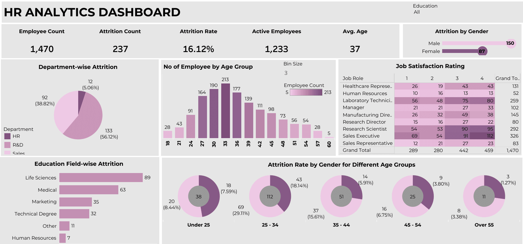
HR Analytics Dashboard
The HR Analytics Dashboard provides a comprehensive overview of key workforce metrics, with a focus on employee attrition and satisfaction. This dashboard displays data on employee count, attrition rate, active employees, and the average age of the workforce. It also presents attrition rates by various demographics, such as department, education field, age group, and gender. Additionally, job satisfaction ratings across different job roles offer insights into workforce sentiment, while visualizations break down employee distribution by age group and the number of employees who have left the organization.
Tableau
Data Visualization
Dashboard
View Project
YouTube Analysis Dashboard
In the dynamic world of content creation, YouTube stands as a significant platform where creators can reach millions of viewers. Understanding the performance of YouTube channels is crucial for content creators, marketers, and analysts. This report analyzes a YouTube Dashboard that provides key insights into various YouTube channels, helping stakeholders make informed decisions.
Power BI
Data Visualization
Dashboard
View Project
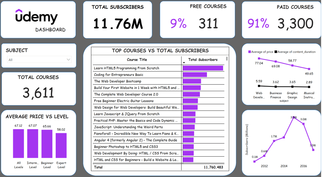
Udemy Dashboard
This Udemy Dashboard provides a comprehensive overview of course performance and subscription metrics on Udemy, a leading online learning platform. The dashboard primarily highlights the total number of subscribers, free versus paid courses, course subjects, and the relationship between course pricing and content levels. Key metrics such as the total number of courses offered, average course price by level, and top-performing courses are visualized to give insights into user preferences and trends on the platform.
Power BI
DAX
Data Visualization
View Project
Testimonials
Testimonials
Hope has a unique talent for taking raw data and turning it into clear, actionable insights that truly made a difference in my project. It’s so refreshing to collaborate with someone who not only has technical expertise but also a genuine understanding of how to solve problems using data. Her contributions exceeded my expectations!

Maduegbunam Kenechukwu
Automation Engineer (PLC Programmer), ZF Group (Germany)
I worked with Hope on a complex data analysis project, and her expertise was exceptional. She skillfully analyzed large datasets, uncovered key patterns, and presented actionable insights.
Her data-driven problem-solving and strategic recommendations had a significant impact on the project’s success. I highly recommend her for any future data-related work.

Onyedikachi Igboanugo
Senior Data Engineer, KUDA
Hope would be an outstanding addition to any team. In my experience working with her, she consistently demonstrated strong analytical skills, attention to detail, and professionalism, delivering data-driven insights that supported strategic decisions across the bank.
Beyond her technical skills, Hope is a collaborative team player who actively engages with cross-functional teams.

Abba StMark
Systems Business Analyst, Keystone Bank
Working with Hope has been a game-changer!
Her ability to sift through large datasets and provide clear, actionable insights has been invaluable.
A true professional with an exceptional eye for detail.


Monsuru Shanu
Data Analyst, Polaris Bank
Blog
Welcome to your go-to blog for exploring the power of data to inform, inspire, and make an impact in tech.